Graphic DesignPhoto Production3D ModelingWebsite DesignSocial Media Management2025
Kılınç Grup — Six-month 360° brand renewal for a corporate hygiene brand
Kılınç Grup is a corporate hygiene company that has been the distributor of Cannon International (OCS Group) in Türkiye and Northern Cyprus since 1998. It installs sanitary pad collection units, sensor-operated dispensers, ambient fragrance devices and consumables, and manages them with regular service.
Over a six-month process that began in September 2025, we rebuilt the brand's strategy, logo, product photos, catalog, 3D models, website and social media as a single team.
- Client
- Kılınç Grup
- Our role
- Strategy, corporate identity, photography, catalog, 3D, web, social media
- Deliverables
- Strategy and social media roadmapCorporate identity · logo, guidelines, business card, letterhead, bagProduct photography · 3 shoot days, 90 frames, cutoutsProduct mockups · more than 60 imagesCatalog · Turkish/English, printed and mobile3D model · renders, USDZ and reference shootWebsite · kilincgrup.com.tr, design and buildSocial media · October 2025–March 2026, reporting
- Year
- 2025
- Media
- 40 images
- Signature color
- Navy
#2A4A7C
Starting point
The brand had 27 years of trust behind it, but its look did not carry that. In the first presentation, we openly weighed the existing logo: its recognizability and its trust-inspiring blue were on the plus side; a modern look, fit with digital screens and a message about the environment and technology were missing. The labels on the devices also carried the old logo.
Strategy: corporate hygiene is not a product list
We started by redefining what the brand sells. Kılınç Grup does not sell individual products; it manages organizations' restroom and common-area hygiene through a chain of product, service and disposal. We built the positioning on this idea: scheduled service, a documented process and a single point of responsibility.
We also wrote the language rules together: 3–6 words on the image, a single sentence and a single call to action in the caption; “women's hygiene,” not “ladies' hygiene”; a document, service slip or report alongside every claim.
Social media was planned in two phases. The first phase focused on digital footprint, awareness and brand value; the second, on expertise content, the product range and sustainability. We explain our planning approach on our strategy and campaign planning page.
Logo and corporate identity
We prepared five logo directions: drop and leaf, modular K, split K and leaf, circular flow, K with a wave stripe. We presented each direction together with the goal it served: corporate growth, a premium look, sustainability or a young audience in the digital space.
The direction chosen was B: the modular K that we had recommended for corporate growth and B2B tenders. In its final form it consists of a blue stem and a leaf-shaped green arm; blue carries hygiene and trust, green carries sustainability. The “end-to-end hygiene” tagline from the presentation was replaced by the Cannon distributorship.
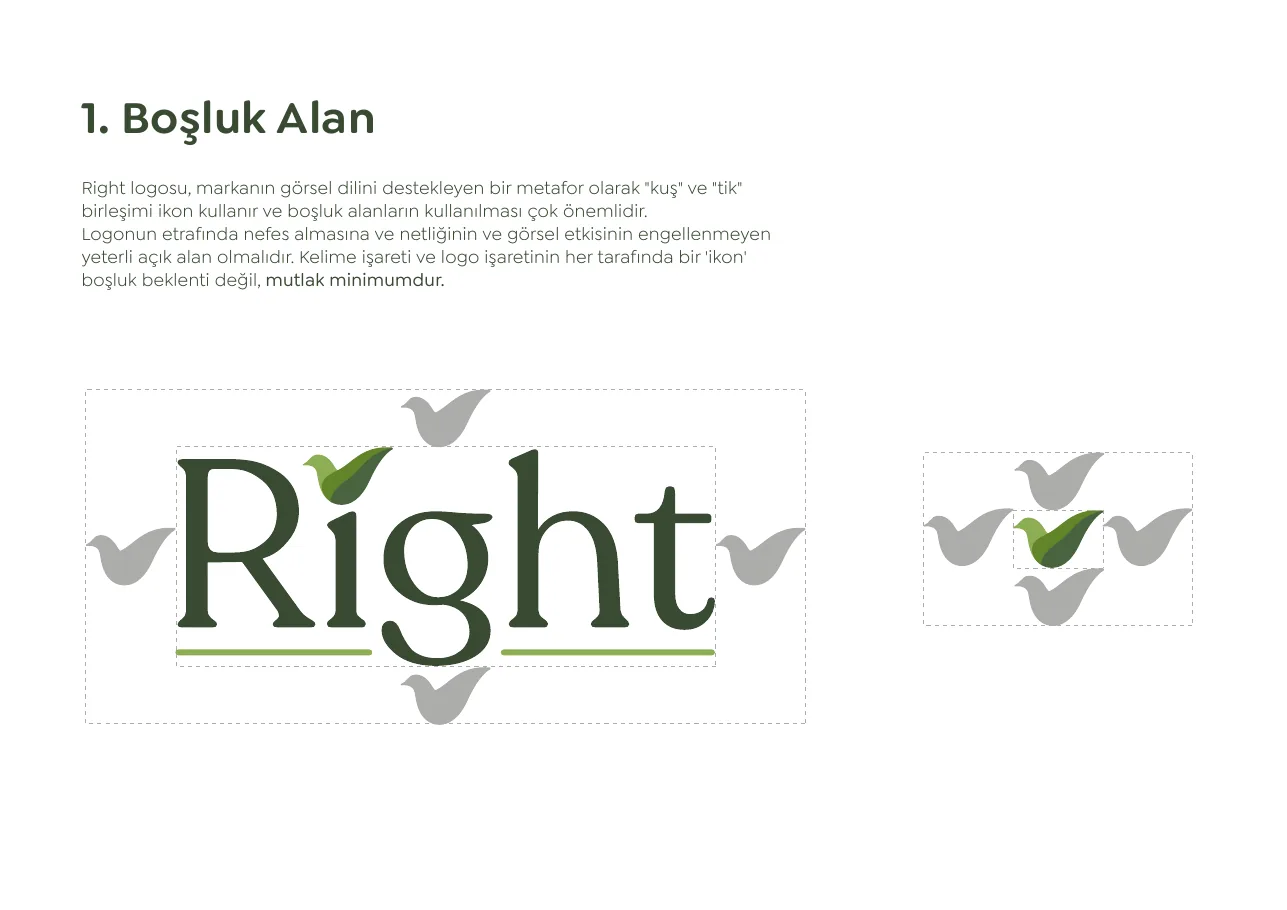
The logo usage guidelines bring together the clear space, the five-color palette, typography, color variations, the minimum size of 20 mm, incorrect uses and print and digital applications in a single file.
The identity was first carried over to printed materials: business card, letterhead, bag and a QR code that is also used in the catalog. For our identity and print work, see our graphic design page.
Product photography: from the shoot to the new identity
On three days in September and October 2025, we did product shoots at our own office and at Kılınç Grup's office. We shot the dispensers, fragrance devices and pad units mounted on a wall, and the consumables on a tabletop. For the shoots we used a Sony A7R V with Sigma 85 mm F1.4 and 24-70 mm F2.8 Art lenses; after retouching, we delivered 90 frames.
The products were divided into white, gray and black color groups and cut out; each was prepared as two cutouts, from the front and from a diagonal angle. This way the same frame can be used on different backgrounds in the catalog, on the website and on social media.
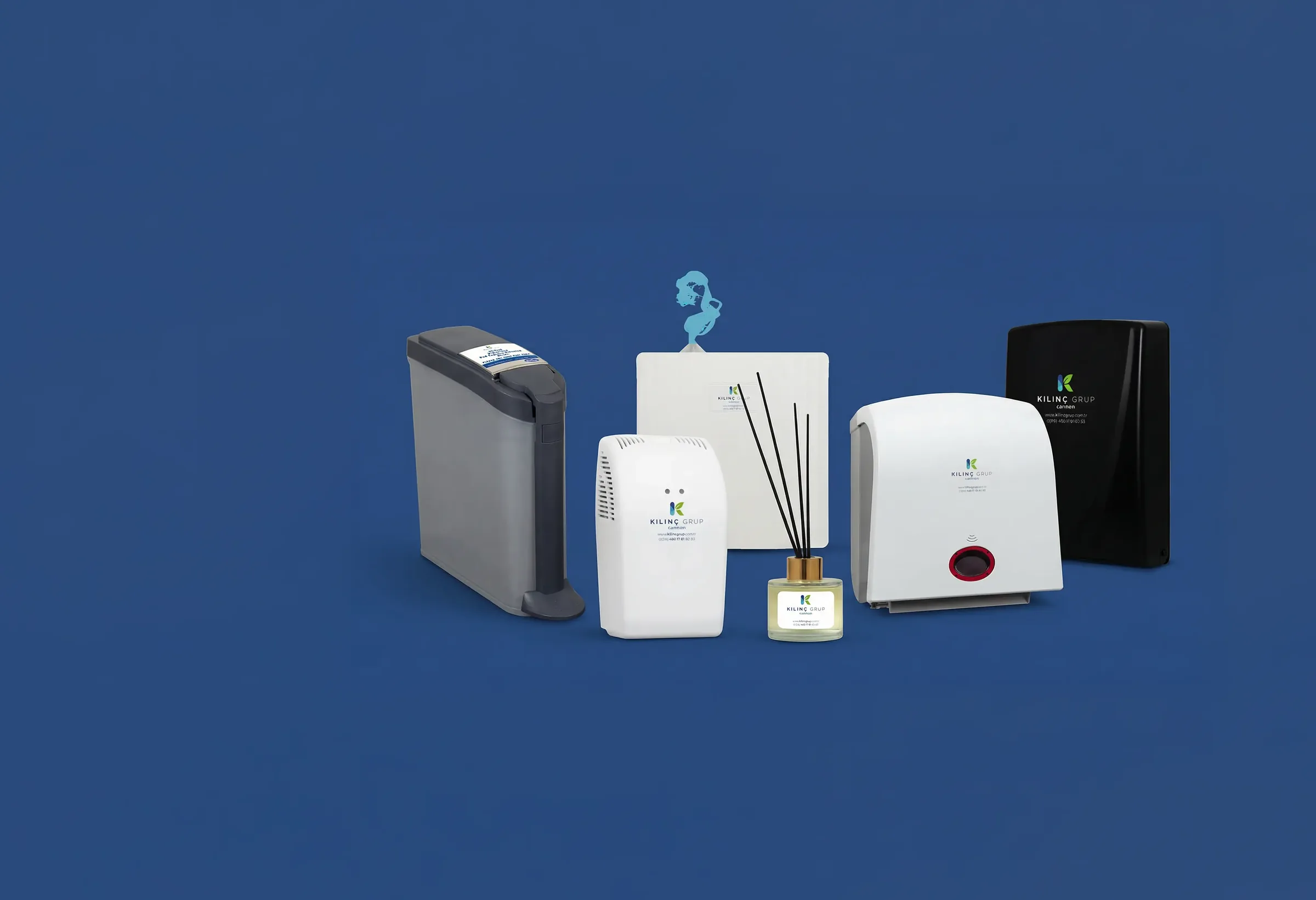
The devices in the shoot carried labels with the old logo. After cutting them out, we placed the new identity on the products and prepared mockups showing each device with its own consumables. Below, from left to right: the shot from the shoot, the cutout and the mockup with the new identity.



More than 60 images came out of this series: the towel dispenser and its roll, the fragrance device and its cartridges, the pad unit and pad boxes. For our product shoots, see our product photography page.

Catalog: Turkish and English, printed and mobile
We grouped the product range into five categories: women's hygiene and care, ambient fragrancing, deodorizing and cleaning systems, toilet seat cover hygiene, and the paper group and consumables. Instead of category opener pages, we gave each product its own page: one large photo, the same heading layout, Turkish and English text.
We also prepared a mobile version of the same design, to be read on a phone.


3D modeling
We prepared 3D models for the sanitary pad collection units, fragrance devices and dispensers. We did the modeling from measurements and reference photos that we took of the products themselves. The models of five products (the pad collection unit, the sensor-operated pad collection unit, the automatic disinfectant dispenser, the gel fragrance device and the black ambient fragrance device) were delivered as USDZ as well as studio renders; with this format, the product can be viewed in augmented reality on iPhone and iPad, on a wall or on a table. Details are on the 3D modeling page.




Website: kilincgrup.com.tr
We designed and built the kilincgrup.com.tr site from start to finish. Products are listed by category; the online catalog, references, certificates and the WhatsApp line can be reached from the first screen. To show the products where they are used, we placed the cutouts from the shoot into bathroom, office and common-area scenes. For our web work, see our website design page.


Social media: October 2025 – March 2026
We managed the Instagram, LinkedIn and Facebook accounts from October 2025 to March 2026. The content followed the two phases in the strategy: cards presenting a single product and a single benefit (“Change before it fills,” “Dispensers don't run empty”), posts explaining the service routine and expertise content that gives the decision-maker a short answer (“Why doesn't scent management work?”: wrong device, wrong location, wrong interval).
Product posts ended with a single call to action: a free site survey, a routine plan or a trial unit. At the end of the period, we reported views, engagement and follower data month by month. We explain how we run this work on our social media management page.
At the end of six months
Kılınç Grup now has a brand that looks the same everywhere: the same logo on the device label, the business card, the catalog, the website and the social media feed. The photos, cutouts, mockups and 3D models sit in a single archive; when a new product arrives, it is shot with the same setup and goes into the catalog, the website and social media.