Graphic Design2022
Right — Corporate identity, bottle and label design
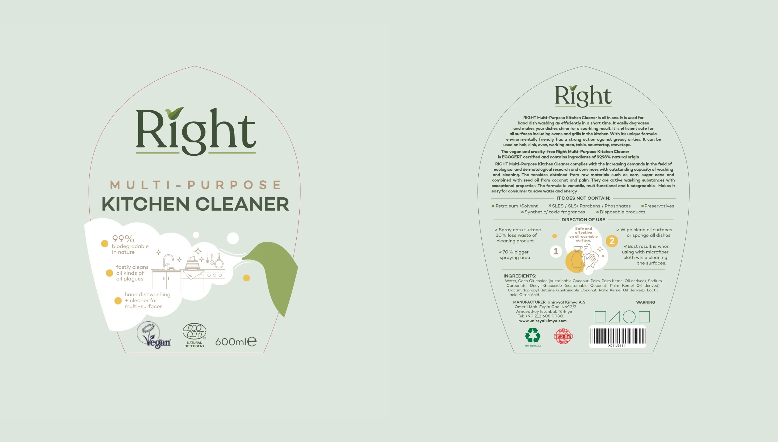
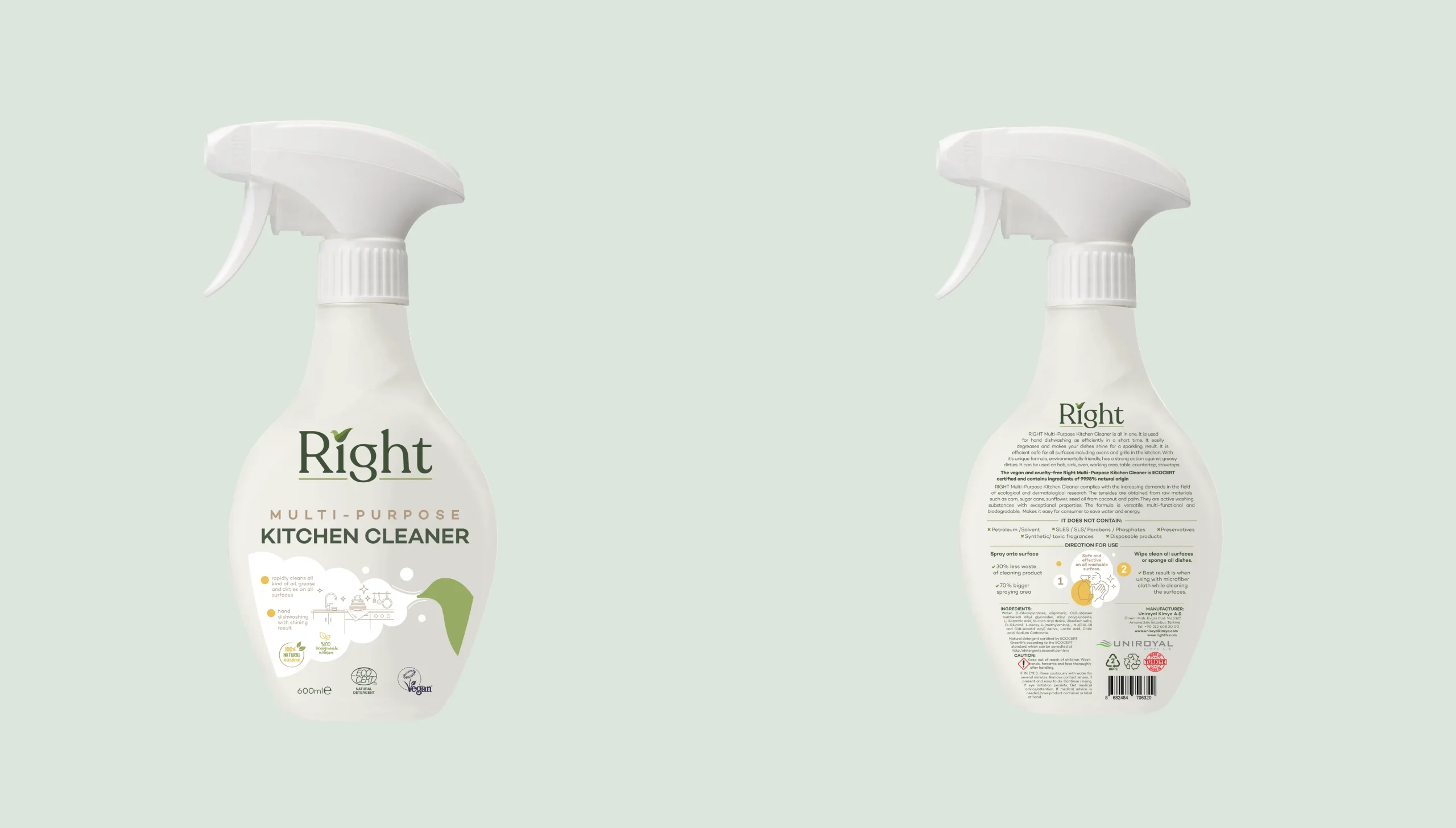
Pippet Creative built the brand from the ground up for Right, the eco-friendly and vegan multi-purpose kitchen cleaner from Uniroyal Kimya: logo and usage guide, color palette and typography, corporate applications such as letterhead and folder, a product-specific bottle form and label design.
- Client
- Uniroyal Kimya
- Services
- Graphic DesignPackaging Design
- Deliverables
- Project · Corporate identity, bottle form and label designDelivery · Logo and guide, stationery, bottle and label
- Year
- 2022
- Media
- 8 images
- Signature color
- Off-white
#DDE5DB
A bird and a checkmark
The Right logo was built around an icon that carries the brand's simple and natural character: the leaf-shaped mark above the “i” is a combination of a bird and a checkmark. In the logo usage guide, we defined the clear space, the colors and the original, black-and-white and single-color uses of the logo.



Three greens and an organic typography
The color palette consists of three shades of green and a cream background; the logo is always used on a light background, with sufficient contrast. For typography, we chose a soft-lined, organic sans-serif family: Goldplay Medium for headings, and Goldplay SemiBold and Regular for body text.
From stationery to the bottle
The identity was first carried over to corporate applications such as letterhead, folder and invoice template; the bird motif appears on the stationery as large, soft green forms. Then we moved on to the product itself: after target audience and competitor analysis, a moodboard and dozens of design trials, instead of a ready-made bottle we designed a new bottle made specifically for the product and a label that is easy to spot on the shelf.
Carton, box, brochure and notebook
After the identity and the label, a kraft carton, product box, A5 brochure and notebook covers were designed for Right. The carton and box carry the brand's three greens and hand-drawn kitchen illustrations onto the packaging surface.
Deliverables
- Logo and logo usage guide
- Color palette and typography
- Letterhead, folder, invoice template
- Bottle form, front and back label design
For the same company's FEAT packaging and promotional film, see our Uniroyal post; for our identity and packaging work, see our graphic design page.